Why Design Is Important
Have you ever been in a store and walked down an aisle with a sea of products but one product in particular caught your eye? What made that product better at first glance than the others? It wasn’t the ingredients; it wasn’t the way it smelled that drew you to it; rather, it was the design of the product. Websites and graphics work in a similar way. Designers appeal to something within us that draws us in. Some call this beauty, but most designers agree there is a general aesthetic, a way to place objects and stylize them, that people find meaningful. Designs can vary from the purely aesthetic to more practical, functional design, meant to convey information in the easiest way possible. Many design philosophies place an emphasize on one design over another other, but, regardless, people notice when poor design and also notice when a design is perfectly executed. They might not know why they feel this way, but it does influence their decisions, much like the product design in a store.
Up Your Brand’s Design Game
Your goal as an online business should be to convey your brand immediately with a design. When someone looks at a banner for your brand, do they know it’s you? Does it look like your other designs, or is it confusing and convoluted? These are questions you should ask yourself when determining your design strategy. Of course, the best course of action is to hire a designer. Designers study the fundamentals of design, understand design theories, and keep up with design trends. Organically Interactive offers design services, so we encourage you to take a look.
As for your brand, there are a few ways you can immediately step up your design game.
Make Your Design Simple
Many business owners believe when designers suggest simplicity in design that they are suggesting an amateur site or something plain and boring; on the contrary, achieving simplicity in design is often difficult. Simplicity is simply the stripping away of the unnecessary elements that muddle your message and puzzle your customers. Instead, try to create a simple design that people can easily navigate and know how to use intuitively. Adhering to a simple design aesthetic doesn’t mean you cannot have a beautiful design with rich colors or design elements, so keep it simple, and you just might notice a substantial increase in conversions.
Colors and Fonts Are Underrated
Pay attention to colors. Colors and fonts are perhaps the most underrated design elements on a page, but they can make or break a design. A pleasant combination of colors can elevate your design and enhance your brand’s appeal. For simplicity, stick with complimentary colors or monochromatic colors. Colors and fonts are perhaps the most underrated design elements on a page, but they can make or break a design.
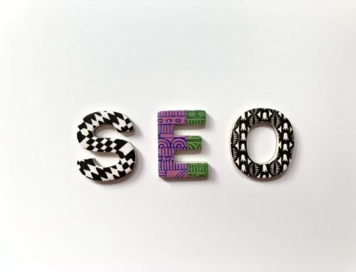
Fonts, on the other hand, are trickier. The construction of letters is complex, more complex than many people care to understand, and while some may say to not use a particular font, there is almost always a use case for every font depending on what your are trying to portray—yes, even Comic Sans.
One hand tool to find free web fonts is Google Fonts. These fonts are easy to incorporate into your designs and also comes with a handy “pairing” tool to find matches for your fonts. Yes, most designers use multiple fonts, but these fonts often share structural similarities. On the other hand, sometimes designers use multiple fonts with different structures for effect.
For a great resource on color theory, fonts, and design basics visit Unbounce.


 CERTIFIED EXPERT